Accessibility is about giving options
June 05, 2021
Building accessible digital products is seen by too many people as a burden that limits their creativity and freedom of expression. I could not disagree more. Creating inclusive user experiences neither has to be boring nor limiting.
The German word for accessibility “Barrierefreiheit“ (absence of barriers) makes it clear that the main objective is to avoid obstacles that exclude anyone because their physical or mental capability. That can mean to remove barriers or to not introduce them in first place.
Accessibility is about choice and giving options
Obviously, not everybody has the same needs and what is fun and exciting for one person might present a barrier for someone else. Likewise, what’s boring to some of us provides crucial simplicity and clarity for others. This is where digital media can shine — if we do it right. It has the fantastic advantage that not every person has to be presented the same page or app as everybody else. To me, accessibility is the greatest form of personalization.
A practical example
I am trying to make my own site, the one you are currently reading, more and more accessible - a little step at a time. There is this feature when a page loads, that animates the content of the page.
I feel that it adds a nice dynamic touch and bit of playfulness to the site. For someone else, it might be a reason to leave because it makes them feel sick, overwhelmed or distracted.
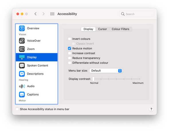
The great thing is that I do not have to make this call on behalf of my visitors. All I need to do is honor their choice. Many technical devices let you choose to reduce the amount of animation and motion they want to experience.
If you are on a Mac, you can try out yourself like this by going to System Preference > Accessibility > Display and check the option Reduce motion. Now, when you reload the site, you should not see any animation. Just a static page of text and images.
We don’t have time for accessibility
All it took to make the site a little more accessible in this example is one line of CSS and a little consideration for my fellow humans who might not feel and think exactly the way I do.
@media screen and (prefers-reduced-motion: no-preference) {
 /* place animation code here /*
}
Now, the animation will be visible to anyone unless they chose reduce motion in their settings.
Where to go from here
The goal is not to be perfect. There is no such thing as a 100% accessible site. But there are a lot of small things we can do to make things better, step-by-step. The important things are empathy for others and making an effort.

